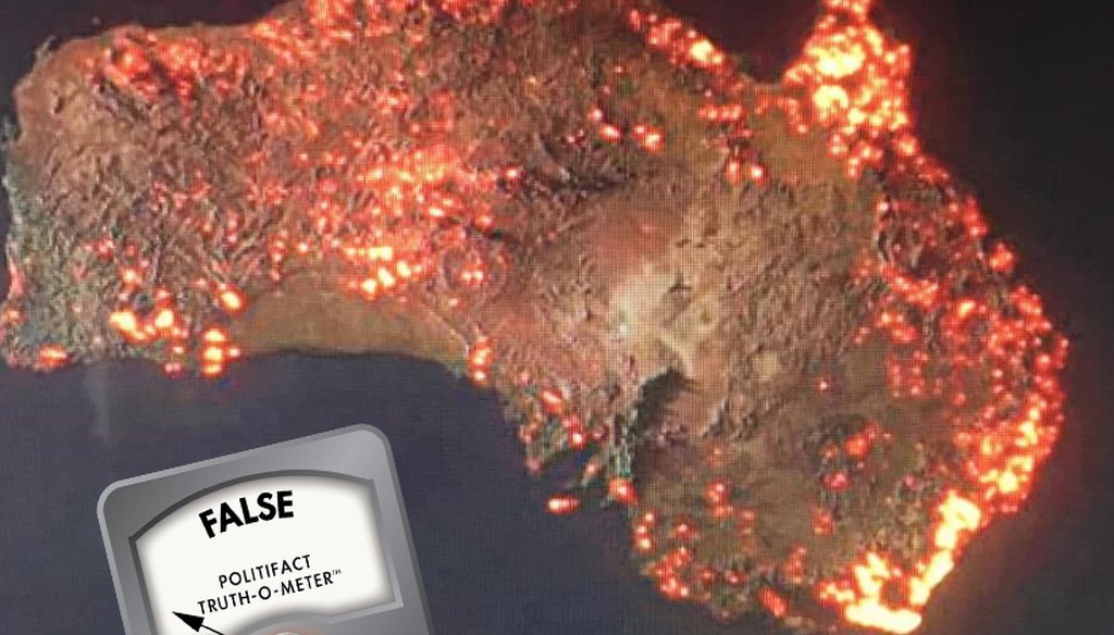

Says an image shows a satellite view of fires in Australia.

Our only agenda is to publish the truth so you can be an informed participant in democracy.
We need your help.

(Screenshot from Facebook)

As wildfires continue to burn millions of acres of land in Australia, some social media users are misusing a digital visualization to draw attention to the disaster.
One image published on Facebook Jan. 5 claims to show a satellite view of Australia provided by a NASA satellite.
"Pray for us please," the user wrote alongside the image, which shows bright orange spots where fires are purportedly burning across the continent.
The image was flagged as part of Facebook’s efforts to combat false news and misinformation on its News Feed. (Read more about our partnership with Facebook.) Similar versions have been shared thousands of times on both Facebook and Instagram, where some celebrities and public figures have reposted it.
The photo isn’t a satellite image of Australia — it’s a digital visualization of fire data.
Anthony Hearsey, a Brisbane-based photographer and graphic designer, created the visualization and published it on Instagram Jan. 5. He said in the caption that he created the visualization using nearly eight months of data from NASA’s Fire Information for Resource Management System (FIRMS), which "distributes near-real-time active fire data."
"These are all the areas which have been affected by bushfires," Hearsey said in his photo caption. "Scale is a little exaggerated due to the render’s glow. Also note that not all the areas are still burning."
That’s different than an actual satellite image of Australia, which does not show glow from the fires at a continental view. (It is possible to see smoke from the fires on some closer satellite images.)


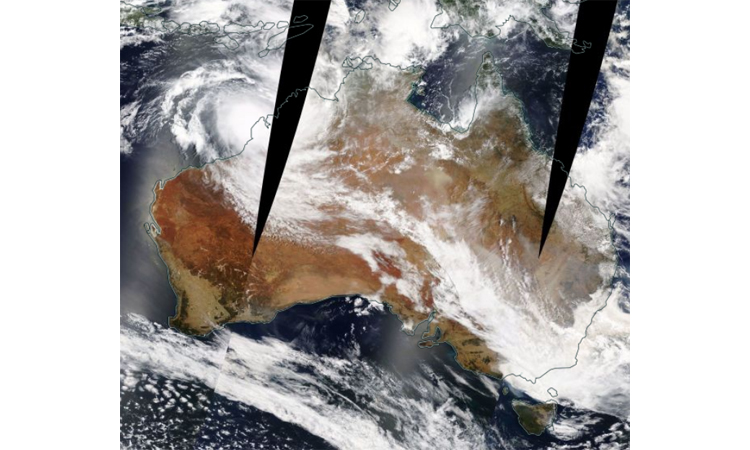
(NASA)
A map from FIRMS that shows the locations of active fires in Australia also helps place Hearsey’s digital visualization in context.
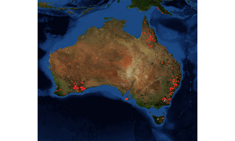
(Screenshot from FIRMS)
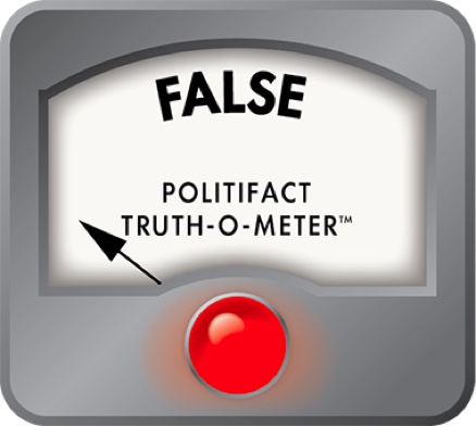
The Facebook posts that portray the visualization as a NASA satellite image are wrong. We rate the claim False.
CNN, "Here's just how bad the devastating Australian fires are -- by the numbers," Jan. 6, 2020
Facebook post, Jan. 5, 2020
Google Reverse Image Search, accessed Jan. 6, 2020
Instagram post, Jan. 5, 2020
NASA’s Fire Information for Resource Management System, accessed Jan. 6, 2020
NASA Worldview, accessed Jan. 6, 2020
Space.com, "Australia's Deadly Wildfires in Photos: The View from Space," Jan. 6, 2020






In a world of wild talk and fake news, help us stand up for the facts.